Tuesday 26 February 2013

Window Displays

As i want to create the feeling of a window display for my show, i have been trying to research displays that are unique and beautiful. I came across Printemps Paris whilst researching. Here are some examples of their displays.


These displays are very beautifully considered and arranged with intricate detail applied in ways you wouldn't even think of. The effects are dramatically eye catching and would make you stop to look. 


I absolutely love these mannequins with the floral arranged bouquet heads. It is an amazing idea and i would like to use this idea if i do decide to make a dress and display it in this way. This idea will give a really quirky twist with flowers being related in my circus theme. It has also made me think that i could draw some circus characters with bouquet heads, i may give it ago. 


These displays below are of a more contemporary fashion and are still beautiful in their own right.


I like how these two images above have the back drop image and then offset to the side the products they want to advertise. This is a similar way to how i want to display as i plan to design a decorative wall hanging.  


Friday 22 February 2013

Final Product Ideas

I have been looking around at different style gift boxes. I had the idea to try and make fabric ones but i'm not sure yet if that will work, it is something i need to test. However i went out today and purchased a few different sizes and style gift boxes to use for the net to create my own. Here are some images


I loved this style of box, it fastened with a ribbon and when opened it just flips open. I think this style is more sophisticated than the normal box standard gift box.

I also loved the slanted sides on the gift bag on the left image, i also liked the scalloped top on the left image. I think it gives a more expensive impression and style. 


I really liked the shape and style of these rounded gift boxes from Marks & Spencer. I would like to also use this idea to make my own. I now need to purchase one to make a net. Then i can start applying design to it. 


Press Pack Ideas

As part of the Professional Practice module i need to create a folder that contains vital information such as my C.V, artist statement, a small portfolio of work, a business card and a disc that holds images of my work. These will need to be made to look of a professional standard. Therefore i am currently researching ideas and will put these ideas into trial attempts to see what the finished look will be.

Here are some images that i have taken from my visit to paperchase


I like how these above have a flap that opens and the contents of my press pack would be held in the pocket on the inside of it. Also it could be made that the flap opens and then the inside flap also opens like a book. The image below shows this as an example 


I really liked this idea below. The folder would be fastened with a ribbon, it would open like a book, but on the inside the documents will be stored in a compartment on the right hand side. I could also put compartments on the inside left panel for my business card and disc. I think this looks professional and neat.


I also took this photo whilst there as i liked how the gift boxes had been displayed with the wrap, which i though was interesting because this is how i want to display my products for my show, but it will be with wall hangings rather then wrap. 


Wednesday 20 February 2013

This Week's Progression.....

This week i haven't had any study visits, therefore i have had more time to continue with my drawing. However i have lost a day of working tomorrow as we are going into University for pattern repeat workshop, which i am looking forward to as i want to understand how to work out and create a repeated pattern.

Monday i was in University working and i was able to catch my tutor for a quick tutorial. I wanted to show my progression and have feedback to move forwards. We discussed that it would be good to draw some flowers from real and to collect good quality images of flowers from the Blooms Journal, then to use these to create some punchy flower designs like one i had done that i showed her, which is below.


I am going to try to complete some more flower designs like this one above. 


Here are some more pictures of work completed this week.


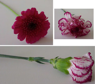
I wanted to purchase some flowers to draw from life, these are the pictures of the flowers i chose.


These are some images of different ways i have tried to interpret flowers.


Sunday 17 February 2013

Munsell Colour Theory


Whilst on my visit to Graham & Brown Julian had mentioned about how strict they were on colour and that they used a colour theory, the theory being The Munsell Colour Theory.
I was interested to find out about what this was as it plays such a vital part in the processes of colour being correct. Julian also metioned that any one applying for a job at Graham & Brown will need to take a colour test. This will determin whether they are considered a successful or unsuccessful candidate for the job. So this just shows how important it is to Graham & Brown to employ staff that have an eye for colour.


The Munsell Colour Theory is a legacy created by Albert H. Munsell in the first decade of the 20th century. His intentions were to help people communicate colour easily and accurately. It provides reliability, flexibility and logical simplicity to visual colour matching and colour identification.

The Munsell system organizes color the way the human eye see colour, making it easy to identify the colors you want. It also serves as the basis for the way color is manufactured, making it accurate and reliable for visually matching color.

The Munsell color order system is based on a three-dimensional model depicted in the Munsell color tree. Each color has three qualities or attributes:
  1. Hue – color such as red, orange, yellow, etc.
  2. Value – the lightness or darkness of a color
  3. Chroma – the saturation or brilliance of a color
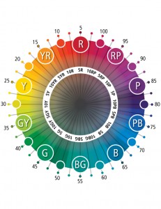
Hue is that attribute of a colour by which we distinguish red from green, blue from yellow etc. There is a natural order of hues: red, yellow, green, blue, purple. One can mix paints of adjacent colours in this series and obtain a continuous variation from one to the other. For example, red and yellow may be mixed in any proportion to obtain all the hues red through orange to yellow. The same is said of yellow and green, green and blue, blue and purple, purple and red. This series returns to the starting point, so it can be arranged around a circle. Munsell called red, yellow, green, blue and purple ' principle hues' and placed them at equal intervals around a circle.

The Munsell color hue circle - a circle of red, yellow, green, blue, and purple

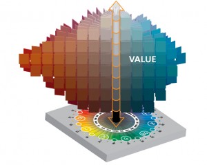
Value indicates the lightness of a color. The scale of value ranges from 0 for pure black to 10 for pure white. Black, white and the grays between them are called “neutral colors”. They have no hue. Colors that have a hue are called “chromatic colors.”

Diagram in red and blue showing the Munsell Color Value

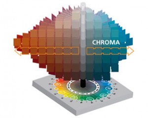
Chroma is the departure degree of a color from the neutral color of the same value. Colors of low chroma are sometimes called “weak,” while those of high chroma are said to be “highly saturated,” “strong,” or “vivid.”
 Munsell_chroma-300x239

Thursday 14 February 2013

Work Experience With Graham & Brown

Whilst on my visit atGraham & Brown i enquired about work experience, I was then informed to email a Senior Designer with images of my work which will then be assessed whether i could be a successful candidate or not. I am very pleased to announce that i received notification today offering me two weeks work experience. Laura my friend also has been accepted and we will go together for the work placement.  I am very excited. :)

Citrus Rain


Thursday 14th February 2013

Today myself and laura went to Citrus Rain in Denton, Manchester. 


Currently we are preparing ourselves for post graduation by exploring real working environments which have enlightened and inspired us by offering an insight into the world of design.
Citrus Rain specialise in the manufacture of dye sublimation, digitally printed silk fabrics for both short and long run production. They have over 10 years experience in the production of digital fabrics and their knowledge of printing is second to none. They also have all the latest digital print technology, guaranteeing the best possible high resolution photographic image reproducibility when required. The same technology can also be utilised to accurately reproduce traditional rotary and flat screen printing.

I was surprised when we arrived, it is a small unit within an industrial estate with 5 printers, heat press machines, a small design area and an area upstairs which is like an office area. They were very welcoming and were very happy to answer questions. We were shown all the different types of fabrics that they print on and could see the difference between how the colour is applied depending on the fabric and how it looks different. Then we mentioned that we have found it difficult searching for other print factories and the lady mentioned that it is because most have closed down due to fabric being printed cheaper in places like China and Turkey, she did say that they are in no means in competition with that as they are highly focused on bespoke printing and quality.

We then went to see the printers and they were printing on transfer paper to then have the design heat pressed so that the ink is transferred onto the fabric and then it will be steamed so that the ink sticks. The gentleman did go through some technical information but i'm afraid that didn't stick and i cant report that back.

We then went to the design section, it was interesting to see the software they use which is set up for the printers also he showed us how he can make a design into repeat to fill the fabric length.

I have enjoyed this visit but i felt a lot more driven and excited with the wallpaper factories, which is good because it does defiantly confirm that i'm better suited to be working in that environment and pushing that area for my final products.

Wednesday 13 February 2013

The Surface Print Co. LTD


Tuesday 12th February 2013

After being in contact with Graham & Brown regarding organising a study visit to see how the factory works and how different techniques are printed like screen printing, digital printing, flocking, foiling etc.. The kind gentleman who organised the study visit to Graham & Brown for me suggested that i organise a visit at The Surface Print Co. LTD as Graham & Brown don't print their own flocked and foiled papers they distribute out to The Surface Print Co. Ltd. This was really good as then i would be able to see how three different factories work and how they differ. I emailed a lady called Abigail and was successful in organising a visit. Abigail was very co operative and explained that it would be easier for myself if i could do the visit the same day as  Graham & Brown only being 10 minutes down the road. Luckily Abigail could fit me in on the same day but we had to go early as she had a meeting and needed to leave by 10.30am. This was absolutely fine and worked out well we were shown all around the factory, the machines were very similar to Anstey. We did however get to see the machine that does the flocking and beading which was different to the other factories. 
Abigail explained that it is a small family run business started by her father in 1989. They work internationally and among well known names in interior design. The business is one of only six major companies in the country manufacturing decorative wall coverings that has survived the contraction of the industry. They have highly skilled and experienced colour mixers and printing staff, which as i have seen in all three of the factories plays a vital part in the work their producing. 

Abigail explained a little about herself, she qualified as an Interior Designer then worked in that environment for a few years and then decided to work in the family business. 

Abigail very kindly gave me a pack sample which had all the different type of grade papers that they print on and also gave me a sheet that explained repeat sizes that the industry work at and allowed us to spend some time in a room that had lots of company sample books to look through as she had to then leave. 

I defiantly have benefitted from these visit and would love to work within this environment. I feel like it has opened a little window and showed me an area within design that i get a great buzz out of.    

Tuesday 12 February 2013

Graham & Brown


Tuesday 12th February 2013


Today myself and Laura went on a study visit to Graham & Brown which i organised to see the different companies work. 

Firstly we were taken to the design studio to meet a lady called Paula. Paula then introduced herself and asked us questions about where we had come from and what we were studying to get an insight as to who we are and what were interested in to see from the visit. 

My first impressions of the design studio were really good, there were mood boards full of images that the team had collected for the trend forecasts, the suite had up to date software and printers, also there was plenty of space, which i feel is important. Paula then introduced us to a few of the designers and senior designers, some that are computer based and others that draw and paint only. It was mentioned that the market is wanting a more painterly approached look on their wallpaper designs currently, therefore all they have to do is scan the art work in and use that to form a repeated design.They also had a few people who would work on the separation of a design to split the colours up ready to put to production. It was nice to meet the different people with the different roles to hear what they do and also to find out a little about their past to achieve the position they have today with Graham & Brown.

We then met a gentleman called Julian, he then took us into the process side of the business starting with the testing area's. First we seen where they make the hand screens for screen printing. Julian mentioned that they use mesh in sizes from 15 to 180 per square centemetre, this enables the screen to be controlled with the amount of ink seeping through, depending on the amount of detail wanted will depend on the size of mesh used. Also he asked, "did we know why the floors were painted grey" We didn't?? It is because it is easier on the eye and doesn't reflect the light which is important especially when people are colour testing to achieve a perfect match. 

We then moved to the section where they sampled the screens with the colour choice from the client. Julian was very good at explaining to us how the machine worked and physically showed us himself by explaining how the screen fitted and locked into position, then he ensured it was adjusted right by checking the pressure handle, this can be adjusted for the amount of pressure that will be pressed onto the screen and then he attached the squeegee to the angle required and then the flood coater at the front of this that will ensure a even amount of 2mm of ink will be put onto the screen all over as it moves to ensure a even coat. Then the paper was vacumed down by the machine to prevent it moving whilst screen printing.  Then Julien put the paper through a machine to dry,  and then took us to another machine that was like a oven set to a very high temperature of 210 degrees for so many seconds and as the paper came out the ink had risen giving a textured effect which looked brilliant.   

He mentioned how they are very strict as a company to try and keep the procedures in testing exactly the same in the factory like the oven temperatures and the settings that the screen machines are set at should be the same as in the factory and also whilst looking at the area where they view a design he mentioned that they have a timer on the bulbs and that they change them at the same time it reaches a certain number all over the factory. There were all types of bulbs in this section to test the paper from the original sample to the newly printed, there were UV, house bulbs, daylight bulbs, halogen etc... all to test that the paper stays the same when the different lights are turned on and off and no differences appear. Julien did show us an example of an original sample and another that had been made with non adative inks used which ment in different lights it looked faded, which as a selling product is no good as it will make customers unhappy that there walpaper is looking shabby and faded, so i completly understand why all these thorough checks are done.

We were shown the paint mix room next and spoke about the different paints like water based and solvent based. He mentioned that as a company they are very dedicated to producing the correct colour and invest highly in this and have a very experienced team on hand that mix and test the inks. Colour is a vital part of a design and it should be highly invested i think. Without the colour our eyes wouldn't be attracted and there wouldn't be much interest for decorated walls. 

We then went on to view the factory, the machines were very similar to the ones at Anstey. It's was really exciting walking around and seeing it all happen and how it works, it really is amazing. The machines are extremely valuable to the company as they print millions of rolls a year therefore they have them maintained and regularly checked to keep them in working order to prevent it being out of operation. Also they are continuously monitored to ensure everything is running smoothly. I also really liked how on some of there machines they had the roll it was working through then another already set up for the next job and it was the same with the ink trays along the machine one would be below with the correct colour in for the next job. Very prepared. Also they can print a double width wallpaper which they print and then cut in half later on which saves time. 

We then walked round and seen where all the cylinder rollers were kept and also then moved on to see where the wallpaper was packaged once cut into the 10metre lengths. These were then packaged into box's on another machine and sent on a carousel to the goods out section ready to be transported to it's location. After seeing this section Julian took into this little office room which he described as a training room that can be used to complete further training e.g. course's in conjunction with UCLAN which is really good to know that you can progress whilst working and it is funded. This really shows the companies enthusiasm in it's employees progressing. 

We then went back out of the factory to a section that was very modern and beautifully decorated. It started with a small gallery that exhibited all there new wall art ideas and then there were several different rooms all with the different styles Graham & Brown do. There was a room which showed designers work that were collaborating with Graham & Brown like Julien Mcdonald,


Laurence Llewelyn - Bowen,


and Barbara Hulanicki 


This would be the area that these type of clients would meet and discuss opportunities. 

Another room was for the super fresco ranges that would be distributed to stores like B&Q, Homebase, Whicks etc.. Another room had all kids wallpapers and ideas in for that type of market clients and there were a few other rooms. 

Also surrounding the rooms were posters of Graham & Browns advertising campaign, i really loved there approach to show everywhere there product but also how versatile it is that it can be displayed in any creative way possible. Here are some examples.


We then went through the marketing area which was sectioned off in different compartments like customer services, over seas orders, directors of the larges firm contracts like B&Q and many more which i can't remember having taken so much information in. As we walked through this area it took us back to the design studio where our visit came to an end. We said goodbye and thank you to Julian and then met Paula again to discuss any final questions that we may have. I did ask about work experience here as i really felt welcome and enjoyed it. I also like the in house design studio that actually designed wallpapers to be printed, not just a manufacturer of wallpaper. I would love to go back and work alongside the team to get a feel for the design stage in studio following through to production as a whole experience. 

Friday 8 February 2013

Study Visit to Anstey Wallpaper Company


Thursday 7th February 2013

I managed to get in contact with Anstey Wallpaper Company to arrange a study visit to the factory. A lady Called Sabrina replied to me with a date, which was 7th Feb 2013 would be available to visit. 

Thursday 7th Feb soon came round and I was excited to go.

After driving to the factory in Loughborough. Myself and Laura went to reception, filled in our visitors passes and waited for Sabrina to come meet us. When Sabrina came to us she walked us to their design studio and kindly offered us a drink while we discussed what we would like out of the visit and she described what she would be able to show us. Also she was asking us questions about our work that we were completing for our final year. I mentioned to her that I had chosen to base my theme on the circus with a floral twist and she loved that idea, also I mentioned that I was struggling to find products by artist/designs who have completed work of this theme. Sabrina said she remembered a company she had worked with that printed a wallpaper of a beautiful circus theme and they were called Mokum. I looked this up as soon as I got home and found the circus print wallpaper.  This is the Wallpaper and it was designed by Catherine Martin for Mokum.


Sabrina started by describing to us about the design studio and how the designers and colourist there are not there to design wallpaper but they play a crucial part in providing a service on advising on contemporary and traditional design and colour trends. They offer support regarding new product developments, e.g. substrates, inks and printing techniques. The stylist may also act on the client’s behalf on any development projects they wish to pursue. The team can also design a complete coordinating package using their experience and knowledge of all the markets and the client’s specific customer’s market sector.


They had the key equipment needed for design and specialist software to develop designs from the initial scan to working up of a source document, including manipulating the scale and repeat, through technical separation and development of the colour palette.

There was another room attached to the design studio, which was for hand sampling. The designers and colourist would use this area to sample smaller scale samples of a clients desired design and sample it with different techniques and colourways, inks, gloss, metalics and pearl which can give a very wide variety of looks.  Once the design is complete and the client is satisfied with the look and style the final colourway will facilitate the handover of collection to the production.


This machine was in the testing room and is where they use the print cylinders to test they are printing correctly and colour test.

Next Sabrina took us to the part of the factory that is hand processed. We looked at the block printing area.  This was the first known method of wallpaper printing and takes a skilled person with a lot of dedication and experience to complete.  Technology today has failed to produce any method that matches the tactility of hand block printing. Also in recent years there have been limited developments whereby other more modern materials such as linoleum, plastic and metal have become available, however these material are more stable than wood, can twist, warp and crack.
The look of block printed papers are however beautiful as we seen in the factory, but these take a long time to produce being such a slow process and very cost effective.


I really can understand why it is such an expensive paper as when you see the quality of the print it is fantastic and the texture is beautiful.

Next we seen the block printed flocking, this was introduced around the late 17th century, possibly inspired by the flocked canvas hangings that were popular in Holland. An adhesive will be applied to the paper that is very tacky and resemble white gloss paint; this can be tinted using pigments to match the colour of flock being applied to add to the dramatic look. Once the paper is coated in the glue and tinted if necessary the length of wallpaper is drawn across a canvas bed where the flock fibers are scattered, this is normally done by hand. Then wooden canes or battens continuously beat the underside of the canvas bed to make the fibers rub together and jump up and down creating static electricity enabling the flock to stand on end creating the key look to the flock. The paper used for flock is heavier because the flock is heavy and a standard paper weight wouldn’t hold this weight and the paper has to withstand a lot of abuse during the beating stage and thinner, lighter paper would tear easier. This method takes around 2-3 days for the glue to dry for each flock colour.

We then went on to see the Pan (through) printing. This method was introduced around the mid 1500’s as a means of evenly colour-washing backgrounds for block printing onto. It is a process that has a steel sheet that has holes drilled into it to create a thin strie stripe as the paper is drawn by motor underneath it. Cutting an elongated channel creates a wider stripe. The tray is continually filled with water-based inks that are released through the sieve-like plate underneath the trough, which sits above and almost touches the face of the paper. The paper is drawn through at a controlled speed, ensuring an even and consistent distribution of the ink. Once the paper is printed it is festooned onto a track suspended from the ceiling and allowed to dry. The inks have to be fully cured before the paper can be taken down and re rolled, ready to be put through the process again for the next colour, or moved onto another process.

We then went onto see the Surface Print machine. This method was introduced around 1839. It continued as the only mechanised means by which to print wallpaper for the next 100 years. It was responsible for making wallpaper available for the masses and it’s immediate success marginalised block printing.
It is the oldest of the mechanised processes and is predecessor to the relief printing Flexo machine. It has a large drum cylinder with print stations spaced around the circumference. The print cylinders are made of a very hard ‘ceramic’ type rubber and the area that you don’t want printing is cut out, leaving the printing surface ‘proud’ on the cylinder. The inks used are water based and transferred via a rotating woolen or felt blanket. The blanket is soaked at one end whilst the other is touching the back of the print cylinder. As the conveyor belt type blanket rotates it picks up the ink from the tray and delivers it onto the back of the print cylinder; the ink is then impressed directly onto the paper as it is rotated. The amount of ink transferred onto the cylinder is determined by the absorbency of the blanket. The more porous the blanket, the more ink, the harder the blanket, the less ink. Also as the ink is water-based it is still wet as it reaches the next part of the print station therefore the application of wet ink applied over wet ink creates an effect where the colours lightly bleed into one another, giving a very soft visual finish.

We then went onto see the Flat-Bed Screen Printing (Silk Screen Printing)
This method was invented in the early to mid 1940’s, later being introduced in Britain from America in the late 40’s. The screen is a rectangular frame with a fine polyester nylon woven mesh stretched across it. The screen needs coating photosensitive polymer, the stencil of the design is then placed flat onto the mesh before the screen is photo-exposed.  The exposure hardens the polymer into an impenetrable lacquer. The area that was masked by the stencil remains fluid and once the screen is washed the stenciled area comes off becoming open mesh. This then allows printing inks through. The screen is placed face down onto a long flat table that has a length of wallpaper laid tight against it from one end to the other. It can print up to 9 wallpaper rolls at a time.  Thick water-based inks are applied to the back of the screen and are drawn across the mesh using a rubber squeegee forcing the ink through the open areas on the mesh in the shape of the design. Once the colour is laid the screen is lifted and moved along the next position, where the process is repeated. It’s important that the inks are allowed to dry fully before any subsequent screens are placed on top. This prevents the screen potentially picking up previous colours laid down and also smudging the design on the wallpaper. To try and prevent this it is normal that they print every alternate screen, before going back and filling in the gaps when the inks have dried. It is a very labour intensive and demands constant vigilance making it an expensive process aimed towards the top end of the market.


Here you can see how many screen there are


These are the hand screen print tables.


This machine above is for screen printing but whereas on the hand screen printing table you move the screen it's self along, with this machine the screen stays stabilised and the wallpaper is attached to what is like a conveyor belt and that moves the paper along.


Next we seen the Rotary Screen Printing method which was introduced in the early 1950’s. The machine would have an in-line configuration with upwards of seven or eight print stations available, each printing one colour. The cylindrical printing screen itself is a very fine ‘honey combed’ type mesh. The screen is produced by photochemical means, in that a photopolymer coating is applied to the surface of the screen before photographic exposure causes it to harden on the mesh. Therefore to create the design it is just a question of ‘masking off’ the mesh with a stencil in the desired shape. The areas of the mesh that have been hardened will not allow the ink through. Therefore the ink is squeezed, under pressure from the inside of the cylinder mesh. The inks used in this process are quite opaque, and rich colours are achievable. It is important that the ink is fully dry before the paper reaches the next print station. Hot air dryers between each print station do this. This method does have the benefit of being cheaper, due to being a continuous print process.

Next we saw the Flexographic Printing machine. It was introduced into Britain in the early 1960’s. The print stations are evenly spread around the outside of a large cylinder drum that carries the paper face out around it. The ink is transferred from the ink tray to the print roller via an ‘anilux’ roller, the purpose of which is to both even out and determine how much ink is transferred onto the cylinder. A deeply cut anilux roller will transfer more ink than a shallow cut one. As the print cylinder rotates the ink is transferred directly onto the paper as it is squeezed against the large cylinder drum. This process will readily accept the use of either water-based or solvent-based inks, although like gravure, solvent based inks are considered more stable for print processes, also more environmentally friendly as the factory collects the fumes from the solvent and then burns them to enable this to heat the factory. Flexo printing is very versatile; it is used extensively in the packaging industry, for printing such things as plastic bags, crisp packets, cardboard boxes, etc.


The Gravure Printing machine was next, it was introduced around 1954 as a development of photochemically etching a design onto a copper plate that was then wrapped around a base. Once engraved the cylinder is electroplated with a thin layer of chrome to create a heard wearing coating for durability. This is necessary as copper is very soft and if it was not protected in some way it would be very easily damaged during the printing process. The benefit of using a gravure printing machine is the ability to print fine tonal work and graduation of colour using a single cylinder. This graduation of colour, governed by the depth and width of each individual cell, can be from a solid colour through to anything as subtle as 20% tint.  Combine this with the fact that a typical gravure machine may have 8 or more cylinder stations, it is easy to appreciate that the perceived amount of colour achievable is extensive.


Here the gentleman in the picture is cleaning the print cylinders in the machine to remove the last colour ink used in preparation to print with a different colour. It is very important they remove all traces of the ink to avoid smudges on the next print.

We then finally went on to see the Heat Embossing Printed Vinyls machine.
The purpose of the machine is to convert a smooth plastic wall covering into a wall covering that has a third dimension. The start of the print process is with a smooth layer of PVC laid onto a backing layer, normally paper. Whilst at this stage the solvent based ink pigments adhere well to the PVC, it isn’t until the whole sheet has been heat embossed does it become ‘fused’ effectively making the inks a part of the coating itself. Sabrina mentioned that this is a very expensive process also and for a cylinder to have the embossed pattern put on can cost 10,000, which as you can imagine doesn’t get many small companies or Artist/Designers using this method.

We also looked at the Digital mimaki printer which are now printing a wallpaper of like the triple width of a standard one which looks really good. Also she showed us another printer that was completing colour tests to ensure the correct colours are in use for the wallpaper. Sabrina also mentioned how they had been delivered a brand new printer that could print to the widest width but print 3 of these at the same time, which is amazing.


This image above shows the mixing room where they mix the inks to achieve the correct colour needed for the client. 


This is how the wallpaper looks after being printed on the machines before taken to the last stage to be checked for defects, cut into 10 metre lengths and packaged by inserting the brand label and wrapped in cellophane for sale.


The image above shows the machine that puts the brand label onto the wallpaper rolls and then wrapped in cellophane.


I have really enjoyed this visit and have benefited greatly as I now have an idea how the industry works and also have the answers to things that I wondered. I had conversations with Sabrina about my final designs and mentioned that I would like to have wallpaper printed for my final product and I asked if it would be possible that they could maybe be the supplier of this, which she said yes and that she or another member of staff would help me through the stages of deciding what print techniques will be best to be used, which is fantastic news. Also if I have any questions she said to just email her. I also asked about work placements, Sabrina said that they do accept work placements but only 1 or 2 a year and the process of this is like applying for a job, sending a C.V, then interview. I also realised that work placements are extremely important as one girl thay took on as work placement showed herself whilst there and they offered her a job at the end of her degree. So it just shows that if you prove yourself good things can happen from it.  I am very satisfied with what I have learnt and I intend to apply for a work placement once I have updated my C.V.